How to Take the Perfect Picture for Your Instagram and Website

We've had alot of questions from other small businesses about our photos, especially those on our Instagram feed, so we thought we'd do a quick post on our DIY photoshoots. Unlike what most people think, you don't need to buy fancy equipment and you can totally do it on a budget. Here's how!
What you'll need:
- A tri-fold white foam board ($9.95)
- Mirror ($10, we picked ours up at Goodwill)
- Smartphone with camera* (we use an iPhone 6 which produces amazing photos)
- Props and materials such as flowers, towels, products, etc ($25, we spent that much on the flowers and had the other materials lying around)
Natural lighting is best
We typically conduct our photoshoots between 9am-1pm. The best days are actually those where it's a bit overcast but not too cloudy. Too much sunlight can product harsh images. We try our best to avoid using artificial lighting and flash.


Minimize shadows with whiteboards and mirrors
The best part of a tri-fold white foam board is that you can actually reflect light by controlling the flaps. We also use a small mirror and place it behind any object that is casting too much of a shadow. It takes a bit of maneuvering and experimenting to see which is the best side to take the photo!


Use a variety of colors and textures to contrast
While white is great for a background (and it helps you seamlessly integrate a photo onto a website) for Instagram, use a variety of materials to create an appealing feed. We love using tablecloths, corkboards, and various table surfaces. Use the tables you have around or create backgrounds out of posterboards and paint. Marble creates a fantastic depth too.


For colors, we love the combination of blue and gold. If you're unsure about what colors pair well together, check out this site to understand "color theory basics".

One of our favorite color pairings follows the "complementary color scheme" rule. Here's an example of how blue and yellow contrast well together. They're opposite of each other on the color wheel, creating a visual pop. Because the pop can be super intense, it's best to use them in moderation.
Also, notice the green and red paint brush contrast? Another example of complementary color schemes.
Understand how to maximize your post-editing tools
We generally use photoshop to edit our photos for the website and stick to the Instagram features for those photos.
Our all time favorite filter on Instagram is Clarendon, which produces vibrant colors and increases the exposure. With some other adjustments (highlights, brightness, sharpness, etc), you can do some serious photo editing!
If you don't have photoshop, we recommend vscocam, which has preset settings that produce some spectacular images.
But if you do have photoshop, we recommend utilizing the "curves" and "levels" functions to adjust the coloring. Here’s a great site for photoshop tutorials on creating some awesome photo effects.


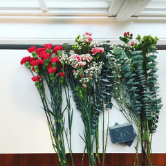
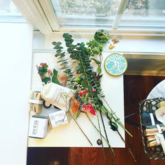
Who has a table that long? We pieced these two photos together in photoshop!
*In the past, we used to take all of our photoshoot photos with a DSLR. The iPhone6 camera has gotten so good that with good lighting, we've realized that we can get away with some good quality photos.
Do you have any tips? Let us know below!


